The Good, The Bad, and The Ugly of the Beautiful Game
Authors: Debangan Dey, Andrew Pita
Screencast

Motivation and Overview
In an era where data analysis is used to inform decision making in almost every domain of life, it is not surprising that it has taken a prominent place in the world of professional sports. Indeed, considering that professional sports are full of quantitative data (games won, points scored, yards rushed etc), and constitute a huge international industry, sports analytics can almost be considered a sub-field of bussiness intelligence.
Broadly, we define three areas in which data analysis can make (or already does make) a contribution to a professional sports organization: scouting for new players, optimizing game strategy, or providing real time in game recommendations.
One well known example of using data analysis to inform scouting is the performance of MLB’s Oakland Athletics in the 2002 season. Under the direction of General Manager Billy Beane, the Athletic’s organization used data analysis to develop measures that were predictive of future player performance and improved upon the current measures used by other teams. In doing so, they were able to use their limited funds to build a team that went on to win the American League West title. The strategy employed by the A’s in the 2002 season has been used and further developed with great success, playing a role in the 2004 Red Sox World Series victory, the 2016 Chicago Cubs World Series victory, and the 2017 Houston Astro’s World Series victory.
Increasingly, data analysis is being applied in the National Basketball Association and has fundamentally changed the way that coaches and managers structure their teams and approach the game. Decades ago, teams with tall and strong post players could dominate the game (see the Lakers three consecutive championships on the backs of Shaquile O’Neal and Kobe Bryant). Today, the most successful teams are built around three point shooting and speed in both ball movement and attacking. Players that we would think of as traditional “big men” can now also shoot from the perimeter, possessing more tools than they did in the past. This is in part due to increased athleticism and improved training on the part of the players, but also from an insight that if a player can shoot over a certain percentage from the three point line, it becomes an optimal strategy for them to take as many shots as possible.
Finally, we return to baseball to illustrate how teams now use data analysis in real time during the game to inform strategic decision making. Because the locations of all a batters previous successful hits can be stored digitally, constructing and updating a probability distribution of their hits during the game is an easy thing to accomplish. Many teams now do this and shift the position of their fielders so that they can optimally defend each specific batter.
In both professional basketball and soccer, leagues and teams have begun investing large sums of money in cameras and technology that provide not only the scoring and success percentage statistics that have always been used in the past, but also fine grained second by second information about where players and the ball are moving and how fast. This new high resolution spatio-temporal data presents new challenges in the field of sports analytics, as teams attempt to use this data to gain a competetive advantage over other teams.
In this project we attempt to utilize data collected by Stats Bomb during the 2018 FIFA World Cup as if we are data analysts for a soccer club, attempting to provide insights to the managers and coaching staff that can improve the teams play.
The Data
This data was obtained from the StatsBomb Open Data repository. You can download this data here
Objectives
We sought to complete three objectives by answering the questions listed below:
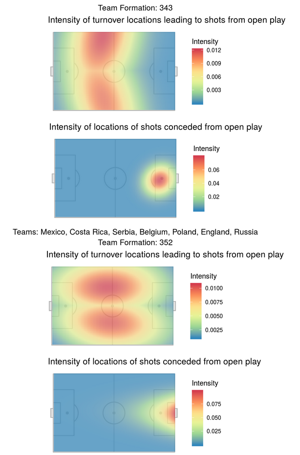
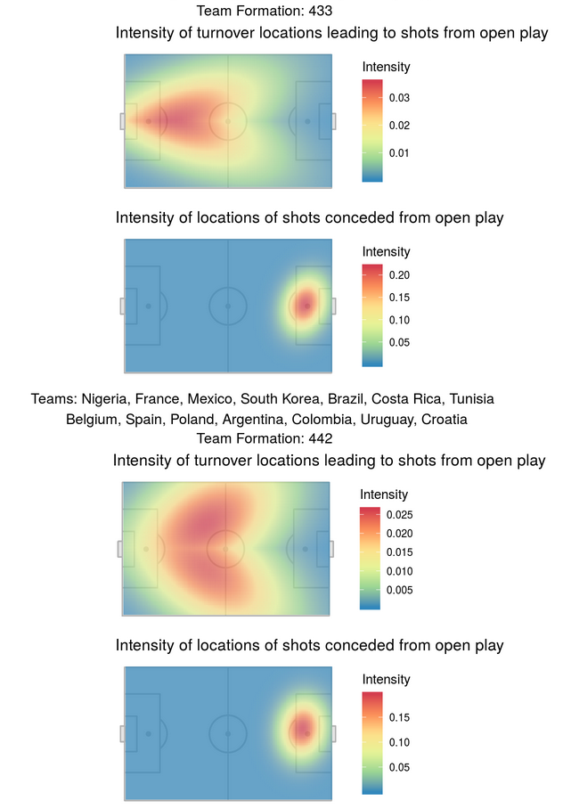
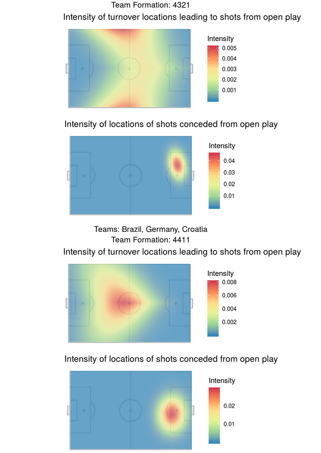
1) Where on the field do most shots on goal came from? Do teams with different formations (the baseline positioning of the players on the field) take shots from locations at different frequencies? Do the locations of turnovers also change based on team formation?
2) What patterns of play give rise to the most effective shots? A play pattern describes the setting in which events of the game unfold. For example, if a team takes a shot that is saved and held on to by the goal keeper, then the next pattern of play begins with the keeper throwing or kicking the ball to one of his teammates. Other examples of patterns of play include play beginning from corner kicks, from throw ins, or from set pieces following a penalty.
3) Can we develop team level summary measures that are predictive of team performance? Data with such a fine grain of temporal detail can quickly become overwhelming. Summary measures such as these would be tremendously useful for a soccer club.
This question led to the development of possession summary statistics that we used to predict both if a shot will take place, and what the XG value for that shot would be.
Methods and Results
Objective 1
Where on the field do most shots come from? Does this differ between formations?
To answer this question we employed a marked Poisson point process, so that we could adjust for the effect of both teams and players. Further details can be found in the Rmarkdown HTML file within our repository. We found that the frequency of turnovers at specific locations does tend to vary by formation, but that when these turnovers lead to shots, the shots happen in very similar locations. See the plots below which are divided by formation type.
Objective 2
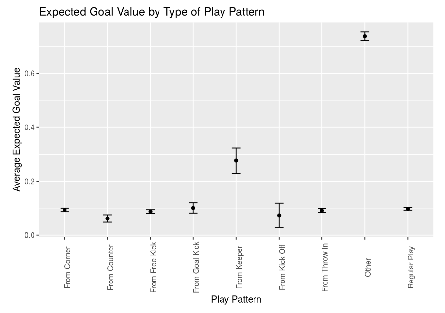
What patterns of play give rise to the most effective shots?
To answer this question we calculated the average XG value for each of the different play patterns within the dataset. These results can be seen in the figure below. the “other” play pattern is composed mostly of penalty kicks and thus has a much higher XG value. XG is a measure provided and calculated by StatsBomb that measures the likelihood of a goal. We were struck that play patterns starting from the keeper tended to have higher XG values.
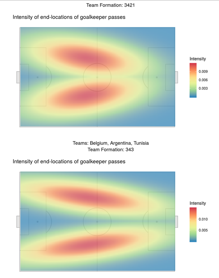
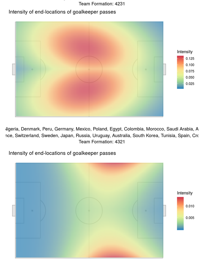
We decided to explore this further by seeing where goalkeepers were sending the ball from either goal kicks or throws or passes after they had taken control of the ball from the other team. To do this we used the same marked Poisson point process described in objective 1, and looked at the patterns of the end locations of those passes for different formations. Again, we saw that these locations were different based on the formation, and also that the goal keepers were generally sending the ball deep into the opposing teams back field, potentially setting up their players for a counter that can lead to an open shot. See the figures below for the specifics of each formation.

Objective 3
Can we develop team level summary measures that are predictive of team performance?
As compared to other professional sports, such as baseball, basketball, or (American) football, soccer has fewer “success” events that can be measured. For example, in baseball most teams will score at least a few runs per game, most batters will get at least one hit, and most pitchers will have a handfull of strikeouts. Similarly, in basketball players will have points in the double digits, a shooting percentage between 20 and 50%, and a handfull of rebounds, assists, or steals. In soccer however, it’s not uncommon for only one or two goals to be scored in the whole game, passes are often intercepted or lost out of bounds, and possession of the ball changes hands very often.
Thus, when looking for summary measures we focused on aspects of possession that could describe how a team is performing over the course of a game. Specifically, we found that the following measure were informative:
1) Timespan: The duration of the possession sequence 2) Passcount: Number of successful passes played in a possession sequence. 3) Time under pressure: The duration the possessing team was under pressure from the defensive team. 4) Pass under pressure: Number of successful passes played by the possessing team under pressure. 5) CHull area: The area of the convex hull created by the points representing players of the possessing team in that sequnece, its expected to reflect the area over which the possessing team attacked. 6) Distance to goal: Distance of the closest point in the possession sequence from the midpoint of goal. 7) Vertical distance travelled: The difference in xx-coordinates of the end location and the start location of the possession sequence, which gives the vertical distance travelled by the possessing team.
From there we developed a logistic regression model that models the probability of the possession ending in a shot given these measures. Seeing that this model performed very well (AUC: 0.95), we added another layer. Given that a shot took place, we modeled the expected XG value using a Gamma function. From these two models, we defined to measures, xSP and xGP. xSP is the probability of a shot output by our model given a new set of possession characteristics. We think of xGP as the predicted XG value given a set of possession characteristics, and is obtained by multiplying xSP by the expected XG value.
In plotting the output of these models for two teams in a match, we saw that they do a good job describing how one team is doing relative to the other. In fact, if you watch one of the world cup matches while looking at the graph, you can almost see when one team starts to get the upper hand against the other. Therefore, we packaged the model and graphs into a Shiny dashboard as a demonstration of a tool that could be useful for a team to have in real time. The Shiny app is located here.
Key Points
The data set with which were working could be explored for at least another month and would yield interesting questions and perhaps answers. Soccer is a complicated game for analysis, in part because successful goals, passes, and assists are such low percentage events. We are convinced that looking at possession summary statistics and spatial patterns is the best way to make use of this data. We believe that the spatial plots created in this project could be used by teams to examine where their potential weaknesses are, and to identify weaknesses in their competitors. Furthermore, the Shiny app that we developed demonstrates that a live in game analytic tool can provide quantitative measures to help teams make adjustments.